ShopDreamUp AI ArtDreamUp

Deviation Actions


Comments28
Join the community to add your comment. Already a deviant? Log In
Because my buddy wrote a critique (nice!) I'll follow up with one so that you have a balance.
I looked at your other pieces, and so I'm starting with the premise that you can do better. Let's consider how.
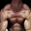
First, focus on the whole. The color balance is okay but it washes a bit toward yellow-green on the skin, and I'm not sure that this was the intended effect. Nothing in the photograph is in particularly sharp relief, and thus the model blends nicely to become part of the graffiti art, if you let your mind go there.
There's a funny bit of sidelight pointing from the left side of the frame, onto his shoulder and arm but not on his neck. This makes me feel that the subject and the background were two separate shots, merged in post process work but without much attention to detail. I get the same feeling from looking at the shadows, which seem a) very regular b) too consistent, and c) too dark for the lack of strong light on the subject. I'm probably wrong (I often am) but without more highlights showing on the body, it is (as RE said) feeling flat, yet with odd shadows.
The vertical and horizontal lines feel more gimmicky to me than artistic or just happenstance. They seem planned. "Stand here, and we'll get these lines running into your head." To what end? The red one in particular seems to be more distraction than element.
I think that you could have worked more on the shot setup and gotten much better results. You have a decent eye for form and composing, and I'd suggest that you spend some quality time working on lighting and shadows as they affect all the parts of the composition as well as the whole.
Consider the two eyes, for example. One is clearly visible, the other is so buried that it turns into a giant black hole. If this were a sci-fi piece, cool. But as portrait photography, maybe not so cool.
My challenge for you is to return to the scene of the crime and rework everything to bring out the interesting lines and shapes, as well as to predetermine where you want the audience to focus attention. For the moment, this piece is a bit all over the place for me.
And as I said, I looked at your other uploads. You most certainly have done better work.